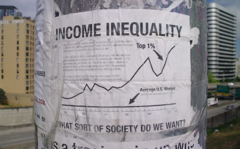
Weintraub Cites Kenworthy’s Work on Income-Inequality
My cousin, sociologist Jeff Weintraub, just forwarded a highly informative post, must reading, excerpting the work of his friend, Lane Kenworthy. Both deserve praise for bringing scholarly attention to a topic that often gets ignored or denied here in Silicon Valley. Perhaps some facts will help. Couldn’t hurt. Here are some excerpts of Weintraub’s excerpts of Kenworthy’s highly useful post:
Lane Kenworthy (Consider the Evidence) March 9, 2008 The Best Inequality Graph
Income inequality in the United States has been rising since the 1970s. What is the most effective way to succinctly convey this fact?
Here is my choice (a pdf version is available here)

bestinequalitygraph-figure1-version3.png
The chart shows average inflation-adjusted incomes of the poorest 20%, middle 60%, and top 1% of households since the 1970s. The incomes include government transfers and subtract taxes. For the bulk of American households, incomes have increased moderately or minimally. For those at the top, by contrast, they have soared.
Read the Rest

distributionofthepie-figure1-test1.png
From 1947 to 1973 [i.e., the quarter-century after WWII that looks to many people, in retrospect, like a “golden age” of continuous economic growth, increasingly pervasive affluence, and decreasing income inequality in all western societies–JW], incomes at each of these three levels grew at an annual rate of about 2.7%. That was approximately the same as – actually slightly faster than – the rate of growth of the economy as a whole; GDP per capita during that period grew at a rate of 2.5% per year.
Since 1973 incomes in the middle and lower portion of the distribution have increased much less rapidly: 0.8% per year at the 60th percentile, 0.5% per year at the 40th, and just 0.3% per year at the 20th. Is this because the economy as a whole has failed to grow? No. The annual growth rate of per capita GDP since 1973 has been 1.9%. Instead, it’s because most of that economic growth has gone to those at the top of the distribution.
The dashed lines in the chart show what incomes at the 60th, 40th, and 20th percentiles would have looked like had they grown at the same 1.9%-per-year pace as the economy since 1973. The difference is striking. Incomes for a very large swath of the American population would be much higher – $15,000 to $30,000 higher – if economic growth since the mid-1970s had been distributed more equally.
One local fable shattered by these data is the prevalent myth that stock options did a lot to close the income gap over the last few decades. More recently, we’re even hearing worried claims from area CEOs and even members of our local congressional delegation (Democrats!) that our middle class will suffer the most, and in very great numbers, if the recent long overdue federal reform mandating stock option expensing by corporations is not repealed. Reviewing the data, though, it looks like it must have been a pretty thin slice of the middle class that scooped up all those stock options despite some pretty misleading and self-serving claims.